Awesome Plotly with code series (Part 5): The order in bar charts matters
And it is not always simply ordering by highest to lowest
Welcome to the fifth post in my “Plotly with code” series! If you missed the first one, you can check it out in the link below, or browse through my “one post to rule them all” to follow along with the entire series or other topics I have previously written about.
A short summary on why am I writing this series
My go-to tool for creating visualisations is Plotly. It’s incredibly intuitive, from layering traces to adding interactivity. However, whilst Plotly excels at functionality, it doesn’t come with a “data journalism” template that offers polished charts right out of the box.
That’s where this series comes in — I’ll be sharing how to transform Plotly’s charts into sleek, professional-grade charts that meet data journalism standards.
Intro - Rethinking bar chart order: when size isn’t the story
The general rule of thumb for visualising bar charts is: plot the bars in ascending (or descending) order in relation to the y-axis. This should probably be no surprise to you. Just to state this basic point, check the 2 bar charts below. The left one is ordered alphabetically with regards to the x-axis, whilst the right one is following a descending order based on the y-axis. Which one do you prefer?
My answer would be: it depends:
If your story wants to focus on highlighting the highest or lowest bars, then the one of the right would be a great ordering choice.
But, what if the x-axis had a certain meaning? What if you wanted to keep that ordering? How can we deal with differentiating (or not) these non-sorted y-axis categories?
What will we cover in this blog?
Scenario 1: Reordering a specific category (or bar) to prioritise it visually
Scenario 2: Using logical ordering for ordinal data
Scenario 3: Displaying a distribution
Scenario 4: Sorting by multiple categories for more layered insights
As always, code and links to my GitHub repository will be provided along the way. Let’s get started!
Scenario 1: The “Other” category - where should it belong?
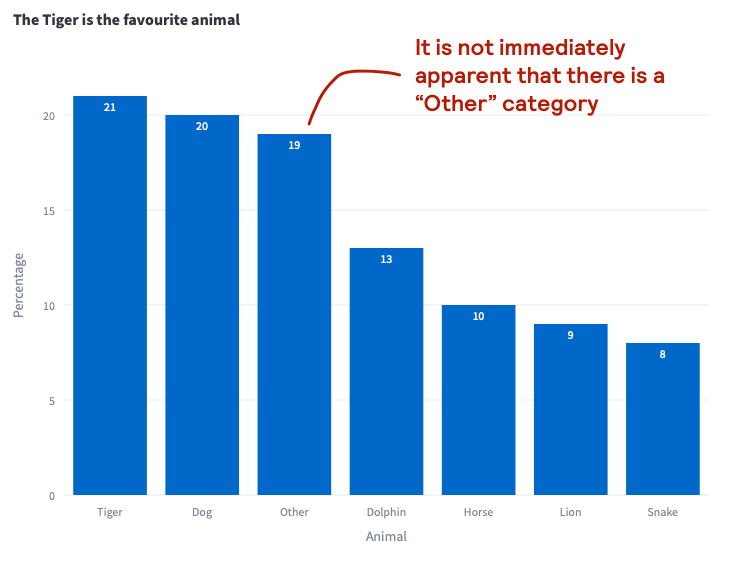
Imagine you are a teacher and are scoring which animals are the most popular across the school year. You might gather information like the dataframe below. The dataframe is ordered from highest to lowest. You detect that the “other” category accounts for the 3rd highest percentage, so you wonder what is the best option to present this data?

1st attempt: single coloured bar chart with a descending order categorisation.
To begin things, let’s plot the basic output that plotly.express would show us.
It is a solid starting point, but you are worried of not highlighting the fact that the “other” category is not a real animal category. It is a category that might represent up to 19 animals, so you would rather ensure the reader immediately understands things.
2nd attempt: using colour contrast whilst keeping the same ordering
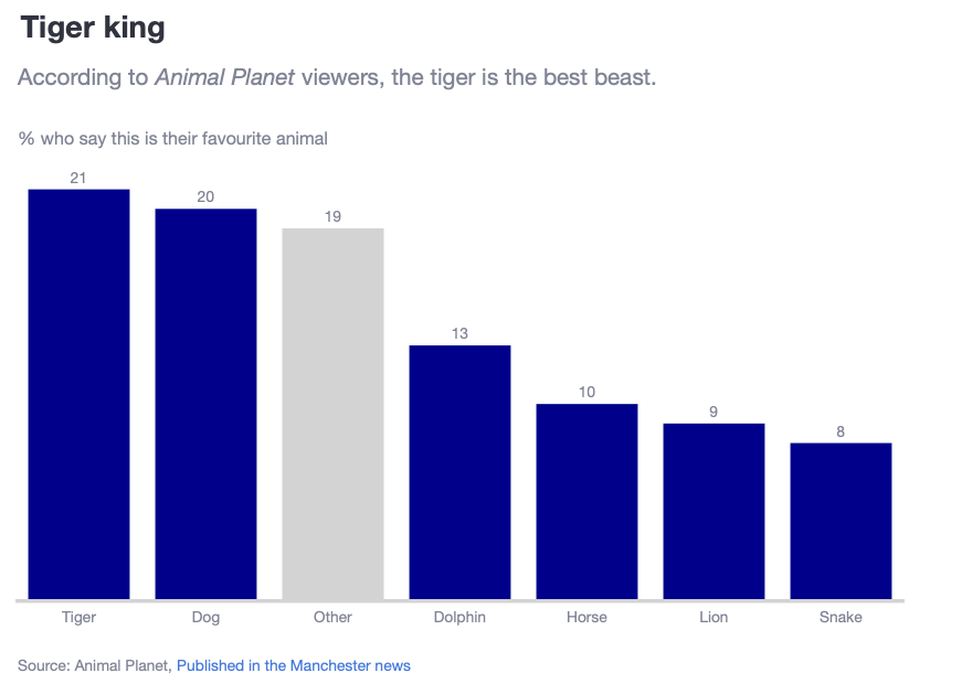
In my previous Awesome Plotly with code series (Part 2): Colouring bar charts post, we saw how colour contrast can be used to ensure that the brain can easily interpret categories. In this case, even if we kept the ordering, we easily identify this “Other” category. You can see that we have done some other aesthetic changes, but the important bit is that the grey box representing “Other” contrasts with the blue boxes which represent real animals.
However, there is still something nagging at you. “Other” is something that in reality you want to separate as a category.
3rd and final attempt: separating the “other” category
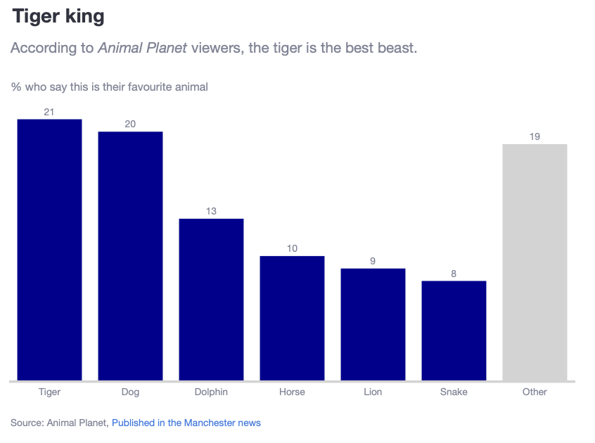
My preferred way to deal with these scenarios is to move the “Other” category to the end of the plot. In other words, keep the animals as a sorting category separate from “Other”. Check the resulting chart below.
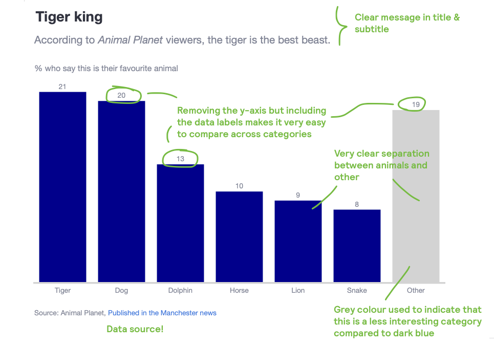
Why do I think this plot is better?
Clear separation of the animal vs other category.
Easy to understand which animal is higher than the other by sorting and showing the actual labels. In fact, the labels help to easily compare where the “other” category would have sat amongst the animals.
Reduced clutter by removing y-axis and grid lines.
Y-axis title rotation horizontally allows us to provide more context than a simple “percentage” text title.
Clear message conveyed by title, subtitle.
Tips on how to create this plot
How to force the separation of both animals vs others?
The idea is to create an auxiliary sorting column. For example, we can create a binary flag: if it is an animal then assign a 1, if not a 0. Then, sort first by this binary flag and second by percentage.
df['SortOrder'] = df['Animal'].apply(lambda x: 1 if x == 'Other' else 0)
df = df.sort_values(by=['SortOrder', 'Percentage'], ascending=[True, False]).reset_index(drop=True)

fig = go.Figure(
        data=[
            go.Bar(
                x=df['Animal'],
                y=df['Percentage'],
                marker_color=[
                    'lightgrey' if animal == 'Other' else 'darkblue' for animal in df['Animal']
                ],
                text=df['Percentage'].round(1),
                textposition='outside'
            )
        ]
    )
Scenario 2: Do not override a logical ordinal ordering
As human beings, there are sequences and patterns that are engrained in our heads. And for us, the sequence of these patterns are higher up in the hierarchy of our brain processing power than other types of sequence ordering. For example:
Week days: Monday to Sunday.
Other temporal sequences, such as daily hour periods, months of a year, etc
A ladder sequence, like “low-medium-high” or “small-medium-large”
Project cycles: planning, design, development, testing, deployment
Skill levels - beginner, intermediate, advanced, expert
With these sequences, it doesn’t matter the dimension we want to present. As human beings we would like to keep these orderings when reading a chart, regardless if a category had a higher or lower value associated with it.
Imagine that I provide you with a dataframe like the one below. How would you present this data?

1st attempt: single coloured bar chart with a descending order categorisation.
To begin things, let’s plot the basic output that plotly.express would show us.
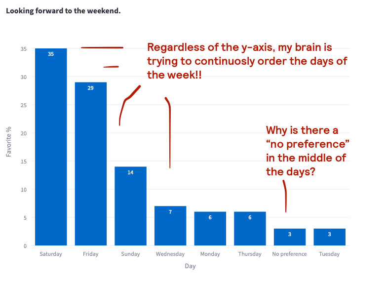
Doesn’t this visualisation hurt your brain? Sure, you can very easily answer that Saturday is the day with the highest percentage value. However, your brain is trying to continuously order the x-axis in the order that you have it engrained in your knowledge. You are sub-consciously trying to push the Monday bar as the first one, followed by Tuesday, etc… Not only that, but this visualisation doesn’t help by putting the “No preference” bar between weekdays.
Final attempt: weekday cycle ordering with an “other” category
The fixes to this bar chart are clear:
Do not mess up the x-axis ordering and keep them as you would expect them in a weekly series
Embed the learnings from scenario 1, where we push the “other” category to the end and with a different colour.
Here is the final result.
Why do I think this plot is better?
Clear weekly trend
Clear separation of the weekday vs other category.
Reduced clutter by removing y-axis and grid lines.
Y-axis title rotation horizontally allows us to provide more context than a simple “percentage” text title.
Clear message conveyed by title, subtitle.
Tips on how to create this plot
How to force the weekly trend and separation of another category?
In this case, I took a super simple approach: create a new column called Day_Number, where Monday = 1, Sunday = 7 and “No preference” = 8. You can actually see this column in the dataframe screenshot when scenario 2 was introduced.
With this in mind, the plot is super simple.
df = df.sort_values(by=['Day_Number'], ascending=True).reset_index(drop=True)

    fig = go.Figure(
        data=[
            go.Bar(
                x=df['Day'],
                y=df['Favorite %'],
                marker_color=[
                    'lightgrey' if day_ == 'No preference' else 'darkblue' for day_ in df['Day']
                ],
                text=df['Favorite %'].round(1),
                textposition='outside'
            )
        ]
    )
Scenario 3: Displaying a distribution
Distributions are the bread and butter of anyone working in data. In scenario 2 we already introduced a type of distribution where the dimension in the x-axis was categorical. The difference in scenario 3 is that this ordering tends to not be categorical and tends to not be part of our subconscious mental model.
Say that you are running a study on luxury house prices in Boston. You want to begin your presentation showing a distribution of how many luxury house prices fall into each house price bucket. Here is the data you might be working with.
The very wrong way of doing this: ordering by count instead of by price_grouped
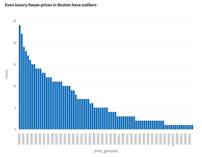
But to make my point, I will show you how a bar chart looks like if we sort by volume.
Clearly this has to be the worst plot I have seen in some time. Whilst you might quickly answer that the most common price for luxury houses in Boston is $4.2 million, everything else is just simply wrong. I don’t even want to go into the details of why it is wrong, I just want to fix this!
The right way of doing this: just plot the data as a histogram keeping the x-axis order
Can’t be any simpler: do not override the x-axis ordering. Period. See the plot below.
Scenario 4: Sorting by multiple categories for more layered insights
In Awesome Plotly with code series (Part 4): Grouping bars vs multi-coloured bars, we actually covered this scenario. In that article, I covered the scenario where you wanted to show 3 dimensions in the same bar chart. For example, you wanted to show the % of smoker by country, but also show which continent each country belonged to. See the example dataframe below.

I will not dive into the process of going from a poorly designed plot to the final result. I will jump directly to my proposed solution. See the chart below.
What have we done here?
When you have multiple dimensions, it can be good practice to decide with dimension you want to order first. In this case, we have given preference to ordering by continent first (ie, grouping the countries within continent) and, then, sort the numerical percentage field within each continent.
Summary
Ordering bars in a chart may seem straightforward, but as we’ve seen, there’s more to it than just descending or ascending by value.
In this post, we looked at different scenarios to rethink chart ordering, from prioritising specific categories like “Other” to honouring natural ordinal sequences. We tackled how essential logical order can be, like weekdays, and how distribution data benefits from its own intuitive structure. We also explored the power of layering multiple categories to deepen insights. By intentionally arranging data, you create clear, engaging stories that resonate more with your audience.
Where can you find the code?
In my repo and the live Streamlit app:
Further reading
If you are interested in more content, here is an article capturing it and organising it all by topics!


