Awesome Plotly with code series (Part 7): Cropping the y-axis in bar charts.
Is there ever a good reason for starting a bar chart above zero?
Welcome to the seventh post in my “Plotly with code” series! If you missed the first one, you can check it out in the link below, or browse through my “one post to rule them all” to follow along with the entire series or other topics I have previously written about.
A short summary on why am I writing this series
My go-to tool for creating visualisations is Plotly. It’s incredibly intuitive, from layering traces to adding interactivity. However, whilst Plotly excels at functionality, it doesn’t come with a “data journalism” template that offers polished charts right out of the box.
That’s where this series comes in — I’ll be sharing how to transform Plotly’s charts into sleek, professional-grade charts that meet data journalism standards.
Intro - A half truth is a whole lie.
I don’t know if you have ever seen the Fox news bar chart pruning “scandal”. If you haven’t, take a look at the screenshot below. Fox decided to scale the y-axis in order to make it seem as if Obamacare was gaining a lot of traction over time (needless to say that a time category should be a line plot, but that is beyond the scope of this post). By breaking the “best practice” rule of “always starting your bar charts at zero”, the chart tailored to a story through a ‘half-truth’.
Just to be clear, this is not a political statement, it is bad visualisation practice statement.
Why is cropping the y-axis a bad practice? When the y-axis is cropped, the viewer loses context for the data. For example, cropping can make it unclear if the charted values are close to a "natural baseline" (like zero) or if the values themselves are relatively high or low.
What will we cover in this blog?
Having understood that you should always start a bar chart at 0, there are instances where having the full range of y-axis values (from 0 to whatever value you want to show), can actually be harmful for the story to tell. So what can we do in these cases?
Scenario 1: Where a bar chart doesn’t start at y=0.
Scenario 2: Deviation plots - where your baseline is not y=0.
Scenario 3: Where starting at y=0 would hide important differences.
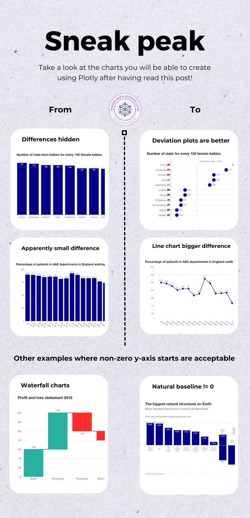
As always, code and links to my GitHub repository will be provided along the way. Let’s get started!
Scenario 1. Can a bar not start at 0?
A bar in a bar chart tends to be read from bottom to top, as if it was a building. That is why, in our human minds - following the building analogy - we would expect a bar chart to begin at 0.
There are not many scenarios where a bar starts somewhere different that is not 0 and it still easily understood at a glance. I can think of 2:
Waterfall charts
Bar charts that reference elements such as geographical metrics where the baseline can be different levels - sea level, stratosphere or the earth cortex.
Let’s see some examples.
Example 1. Waterfall chart
Waterfall charts are super common in the financial world. You can see below a mock-up waterfall chart that I created with Plotly.
What are the characteristics of waterfall charts?
You can see that there are bars that are not starting at 0.
However, there is a continuous flow from bar to bar, which makes it very similar to a stacked bar chart.
In addition, for every step there is a new baseline drawn (with a black line), which kind of makes each bar as if it started from a “0 type” baseline.
Finally, the overall chart does actually start at 0. We are not breaking the rule that a bar chart should always start at 0.
Tips on how to create this plot
How to build a waterfall chart in Plotly?
Thankfully, you don’t need Plotly magic to create this chart. A
go.Waterfall()method exists for us to use!
fig = go.Figure(
   go.Waterfall(
      orientation="v",
      measure=["relative", "relative", "relative", "relative", "total"],
      x=["Sales", "Consulting", "Purchases", "Other expenses", "Profit before tax"],
      textposition="outside",
      text=["+60", "+80", "-40", "-20", "80"],
      y=[60, 80, -40, -20, 0],
      connector={"line": {"color": "rgb(63, 63, 63)"}},
   )
)

fig.update_layout(
   title=dict(text="Profit and loss statement 2018",
              font=dict(family="Helvetica Neue", size=18),
              ),
   showlegend=False,
   margin=dict(t=100, pad=0),
   height = 500,
   width=600,
   font=dict(family="Helvetica Neue"),
)
Example 2. Geographical measurements
Now imagine that you are a geography teacher. You would like to challenge your students with the following questions: (1) What are the tallest natural structures on Earth? (2) What are the tallest mountains on Earth?
You purposely want to ask these questions as most students would answer “Mount Everest” for both. But you would like to shock your students by presenting geographical elements such as trenches and mountains that are below sea level. This is the data you collate for them to plot.
In the screenshot above, I have highlighted in green how Mauna Kea is the tallest mountain, but, it surfaces less over sea level than Mount Everest. How would you plot this data?
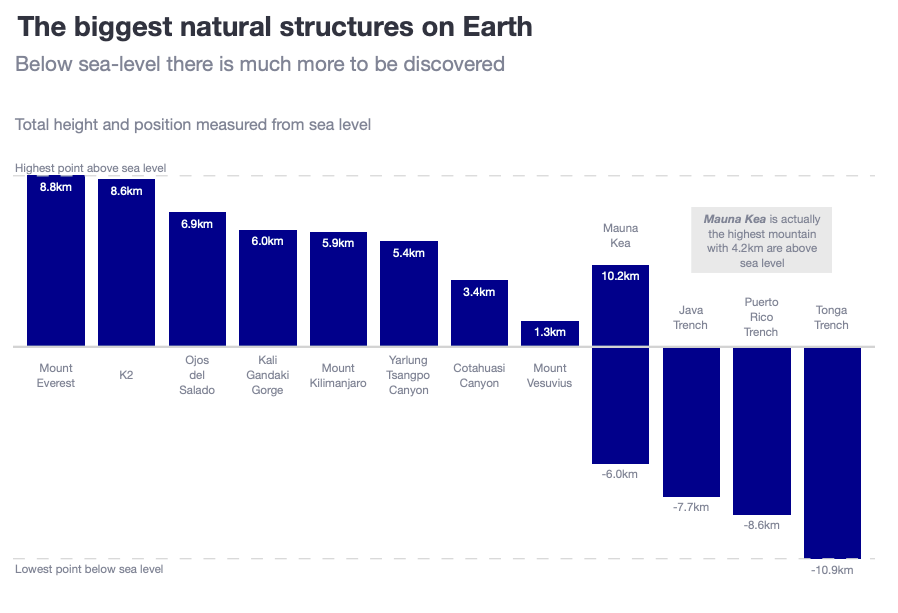
You can see below my take on plotting all this information in 1 chart.
What are the characteristics of this chart?
The chart does actually have a 0 line (representing sea level). In addition, I have added 2 auxiliary lines to represent the maximum values above and below this 0 line.
The bars are ordered in descending order. You can easily detect that Mount Everest is the tallest mountain above sea level.
By having bars with negative values, we make it easy for the reader to understand that there are geographical features that are below sea level.
I have paid double attention to Mauna kea. First, I added 2 data labels: where does the base start below sea level, but also, what is the total height. In addition, I included a grey box clearly mentioning that Mauna Kea is the tallest mountain.
Scenario 2: Deviation plots
Imagine a scenario where you want to compare categories, where the differences between them are small and, in addition, the values of the y-axis are big. Check the dataframe below:

1st attempt: A simple bar chart with a benchmark baseline
I think the chart below is a solid starting point. However, because the bars start at 0 and the range of values are so big, the bars look like skyscrapers. The main point that we want to show in this chart are the differences between higher and lower countries, and with these skyscrapers, you don’t really feel the difference between China and Zambia.
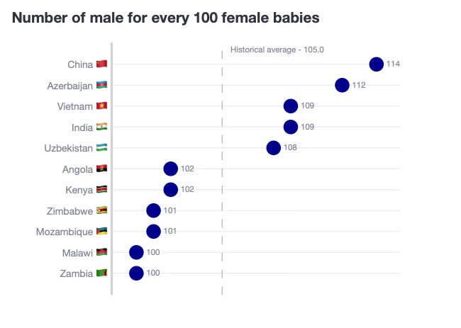
2nd attempt: A deviation plot using a bar chart (a.k.a. Flagpole chart)
Flagpole charts is a modified bar chart. Flagpole charts have a baseline (it can be 0 or different to 0), where the bars are elevated on top of (or below) the “flagpole”. Flagpole charts make it easy to focus on relative differences between data points, especially useful for comparing incremental changes or to show deviations from a target or benchmark.
Tips on how to create this plot
1st, plot a vertical baseline.
hist_avg = df['ratio_avg'].min().round(0)
fig.add_vline(x=0,
   line_color="darkgrey",
   line_width=3,
   annotation_text=f'Historical average - {hist_avg}',
   annotation_position='bottom right'
)2nd, create a deviation feature.
return_df['deviation'] = return_df['ratio'] - hist_avg3rd, plot a bar chart where the x-axis is ‘deviation’, but the text that you show is the actual ratio.
fig.add_trace(
        go.Bar(
            y=df['Entity_text'],
            x=df['deviation'],
            orientation='h',
            marker_color='darkblue',
            text=df['ratio'],
            textposition='outside',
            showlegend=False,
        )
    )
3rd attempt: A deviation plot using a dot chart
The previous chart is, in my opinion, quite valid. However, given that we know that best practice indicates that bar charts should always start from 0, we are breaking this rule. In order to not break it, we can make a slight adjustment and transform the deviation plot from bars to using dots.
We actually presented a “lollipop” chart in Awesome Plotly with code series (Part 1): Alternatives to bar charts, so the idea is to use something similar here too. Instead of having big coloured bars, by using dot plots, our attention is focused on each individual dot, not on the whole length of the bar. In my opinion, this deviation scatter plot is much better.
Tips on how to create this plot
Good news… you do the same as the flagpole chart but instead of using go.Bar(), you use go.Scatter()!
Scenario 3. Hiding behind big numbers in bar charts.
In scenario 2 we already saw how bar charts can hide small changes behind big numbers. In scenario 3 we cover the same idea but in this case where the change happens over time.
Imagine you are a consultant working for the NHS. You have been gathering data about the % of patients in A&E who wait 4 hours or less (as if 4 hours was a short waiting time…) You know that the NHS had a target of 95% back in 2018. Therefore, you want to show the evolution of this % metric and it’s comparison against a benchmark. Here is the data you gather.

1st attempt: If you want to be nice to the NHS, use a bar chart.
You first go with a bar chart. You don’t want to mess up with the rule of not starting your bars at 0. All in all, the chart does somehow show the decline over time. It also shows that you are now the furthest away from the 95% target.
But it does not convey a dramatic change. Because they start at zero, the highest starting point (70%) already seems big. In other words, you are presenting the true data, but with a view of pleasing the NHS folks at the top.
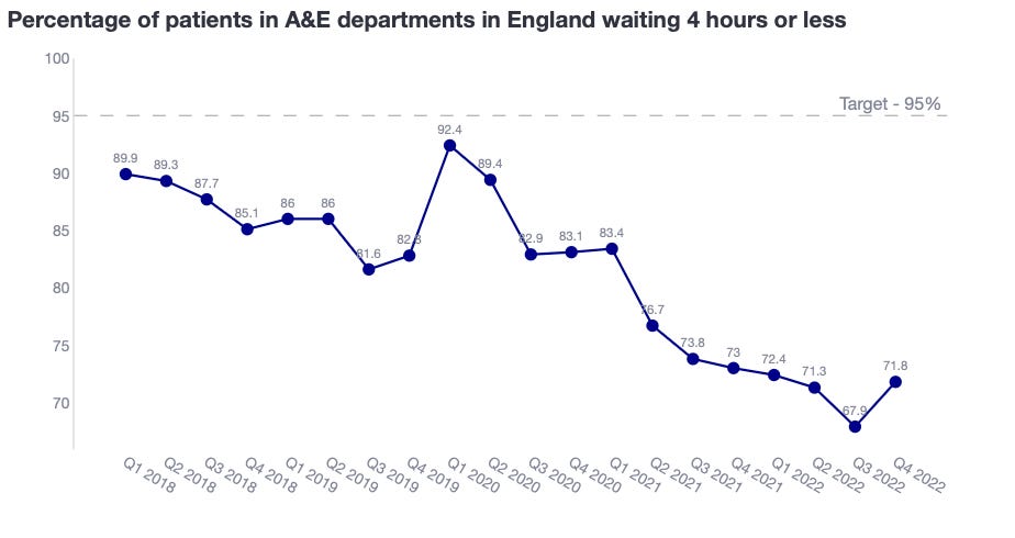
2nd attempt: If you want to show a dramatic change to the NHS, use a line chart.
Lines and dot charts are not anchored on the need to start at y=0. Because of this, we can zoom in to relevant value ranges to emphasise our story. Can you see the difference with the chart below?
The change is much more dramatic, creating a sense of urgency to “stop the fall”. By having the lowest % at the lowest part of the chart, we are evoking that we “hit the floor”. In the bar chart, the floor was 0 and therefore, we were super far away from hitting it.
Summary
In this article, we explored the impact of y-axis manipulation on bar charts. The best practice rule is to start bar charts at zero for clarity and honesty. However, if you need to tell a specific story, you might need an alternative. For example, flagpole charts or deviation charts help with focusing on differences against a benchmark or between groups. In addition, line charts don’t require starting at y=0, which helps focusing on differences over a trend in time.
Nevertheless, the article should convey that:
Bar chart should always start at 0.
If you are thinking about not starting at 0, then switch the type of chart.
Where can you find the code?
In my repo and the live Streamlit app:
Further reading
If you are interested in more content, here is an article capturing it and organising it all by topics!


