
Module 6 - How to fix bad axis labels
A chapter in the Master Data Storytelling course on making axes readable, structured and aligned with the message.


Welcome to the sixth post in my “Master Data Storytelling” series! If you want the full overview of the course, the main course website has everything you need!

A short summary on why am I writing this series
Over the past decade, across teams and industries, I kept seeing the same pattern:
smart analysts producing charts that buried the message under visual noise. The problem was never the numbers: it was the design.
That’s where this series comes in — I’ll be sharing how to transform charts into sleek, professional-grade charts that meet data journalism standards.
And for those who enjoy code, every improved chart can be recreated in Plotly, so the story survives beyond a screenshot.
Making axis labels work for you (not against you)
When we think about designing a bar chart, the visual focus often lands on the bars themselves—their heights, colours, and arrangement. But while the bars show the magnitude of values, the axis is what tells us what those values represent. They provide the structure that allows the reader to understand what the chart is actually showing, but they are also one of the easiest areas to overlook.
Many common issues stem from default settings: y-axis titles rotated vertically, category names that stretch across the screen, or numerical values that expand into long strings of digits. These details seem minor, but they can significantly affect comprehension and storytelling.
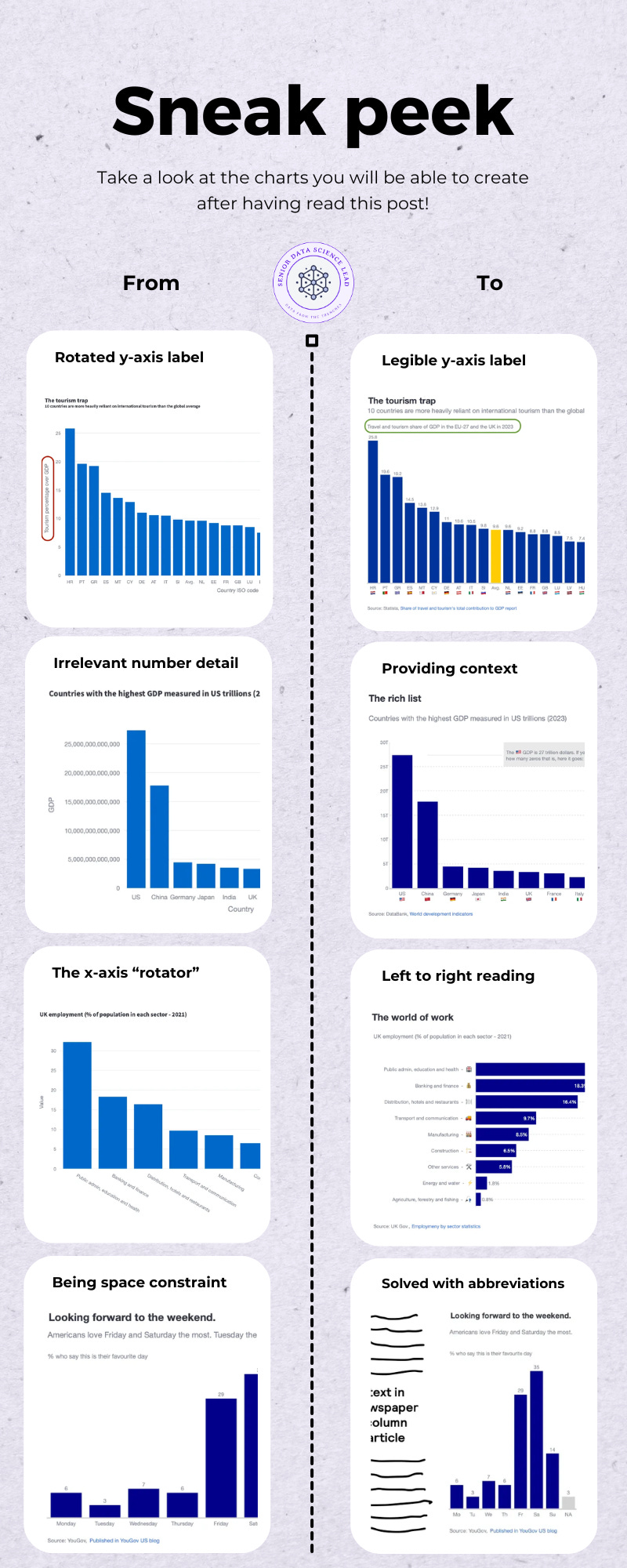
This module shows you how axis labels shape the clarity of a chart — and why small decisions about text, scale and formatting often matter more than the bars themselves. You will work through four transformation scenarios:
Scenario 1 (🔓 free): The rotated y-axis title — and the first structural fix.
We begin with a default bar chart where the y-axis label is rotated vertically. This disrupts the natural left-to-right reading flow and adds visual strain. You will replace the rotated title with a clean horizontal label placed above the chart, improving legibility without changing the underlying data.Scenario 2 (🔐 paid): Handling large numerical magnitudes without overwhelming the reader.
Here we deal with data on the scale of trillions. Writing out every digit produces clutter; abbreviating without context produces ambiguity. You will combine abbreviation with clear magnitude cues, ensuring that the axis communicates scale precisely and efficiently.Scenario 3 (🔐 paid): Presenting long category labels without resorting to rotation.
When category names are long, rotating text on the x-axis is the usual default — and the usual problem. You will rebuild the chart as a horizontal bar chart, using structure, alignment and optional icon labelling to make long strings easy to read.Scenario 4 (🔐 paid): When space is limited — using abbreviations responsibly.
In tight layouts, full labels may simply not fit. You will learn when abbreviations are acceptable, how to choose forms the reader can interpret instantly, and how to preserve clarity even when the visual footprint is small.
With that foundation in place, we turn to the issue that appears in almost every default bar chart: the rotated y-axis title.
Scenario 1: The rotated y-axis title — and the first structural fix.
I have always wondered who decided that rotating a text 90 degrees for the y-axis was a good idea. First, at least in Western countries, we read left to right, not bottom to top. Second, if you rotate the text, you will have to be the exorcist child to read the text parallel to your eyes. And third, it can crowd the chart—especially when you’re working with multiple subplots or small-scale visuals. You just have to check your Excel defaults and see that vertical text is the default.

Let’s recover an exercise we completed in module 1. There we introduced an exercise where you would take the role of presenting to an expert audience, who would expect all 27 European Union countries to be represented in a chart. If you remember, the default chart looked something like this.

It is clear that having this vertically rotated title disrupts reading direction. The chart below removes the rotated y-axis title entirely and places a clean horizontal label above the plot. This keeps the visual structure intact while improving readability.
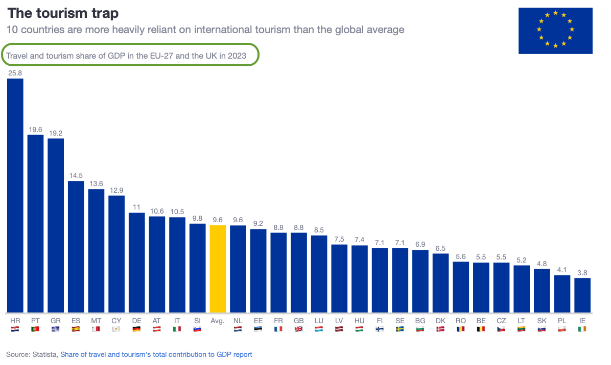
What changed:
the y-axis title is hidden
a horizontal annotation is added above the chart
the layout margins are adjusted to create space for the new title
The underlying data and bar design remain exactly the same. Only the structure of the chart has changed — yet the improvement in readability is immediate.
How to implement this in Plotly
Below is the minimal pattern for recreating this approach:
# 1. Remove the rotated y-axis title
fig.update_layout(
    yaxis=dict(title=”“, visible=False)
)

# 2. Add space above the chart
fig.update_layout(
    margin=dict(t=100, pad=0)
)

# 3. Insert a horizontal title as an annotation
fig.update_layout(
    annotations=[
        dict(
            text=”Travel and tourism share of GDP in the EU-27 and the UK in 2023”,
            xref=”paper”, yref=”paper”,
            x=0, y=1.07,
            showarrow=False,
            font=dict(size=14),
            align=”left”
        )
    ]
)
This pattern gives you full control over placement, alignment and wording, and it works consistently across different chart sizes. With the y-axis title resolved, we move to a different kind of clarity problem: what happens when the numbers themselves become too large to read comfortably?
